kitchen stories
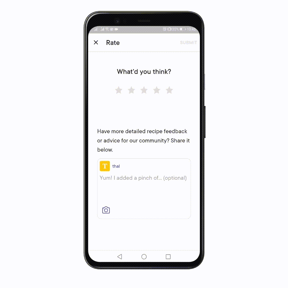
Rating & commenting
Shaping the digital food space with leading technology and content
Challenge
Making rating, commenting and reacting to community comments easily accesible in one place.
PROBLEM STATEMENT
“Users are unsure of where to rate or comment within a recipe. The aim is to remove any uncertainty and make the steps clear”
Project:
Native app
My Role:
UX/UI Design
Tools:
Figma
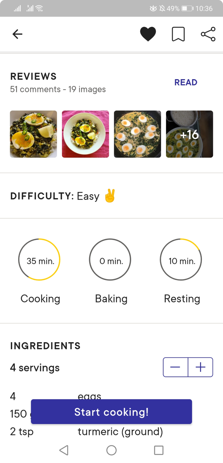
CURRENT FEATURE
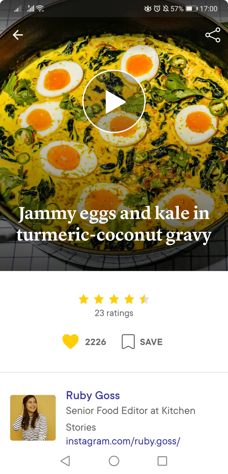
With the stars and ratings under the picture a user is unsure of what happens when clicking on this part of the screen. Does it open other user's ratings or the opportunity for one to add their own, or both?
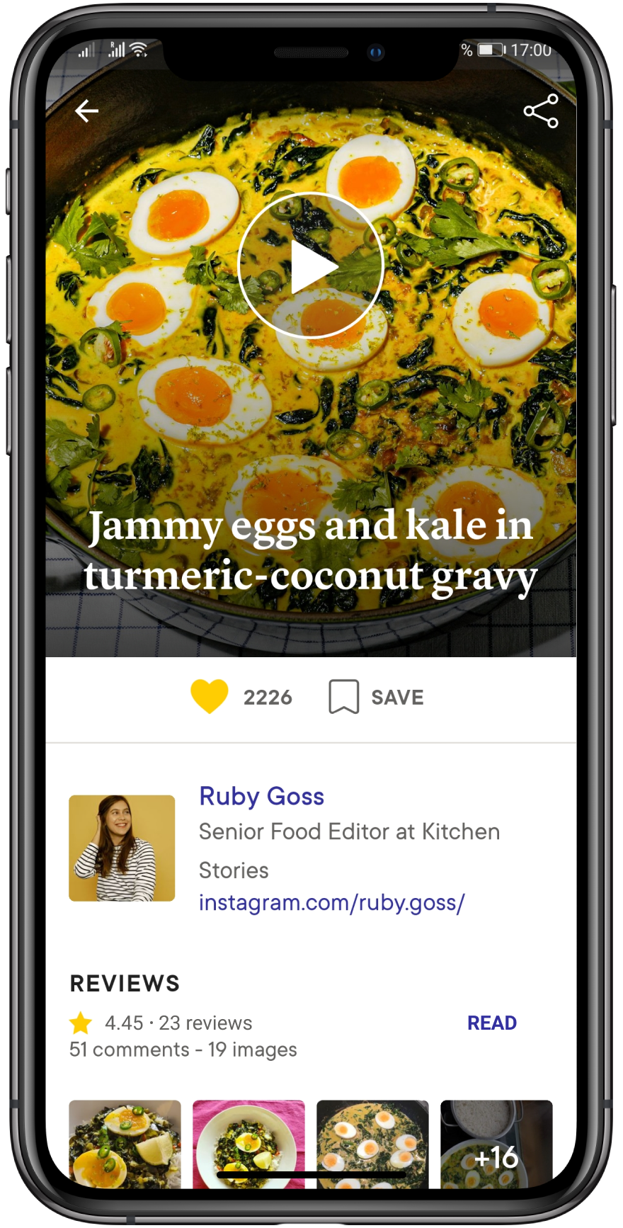
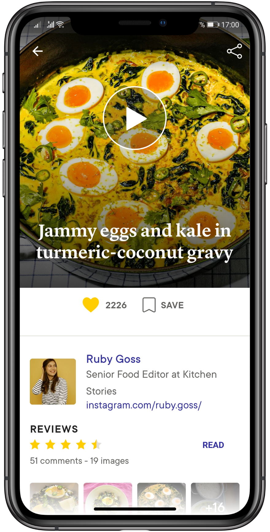
GETTING INSPIRED FROM WEB DESIGN
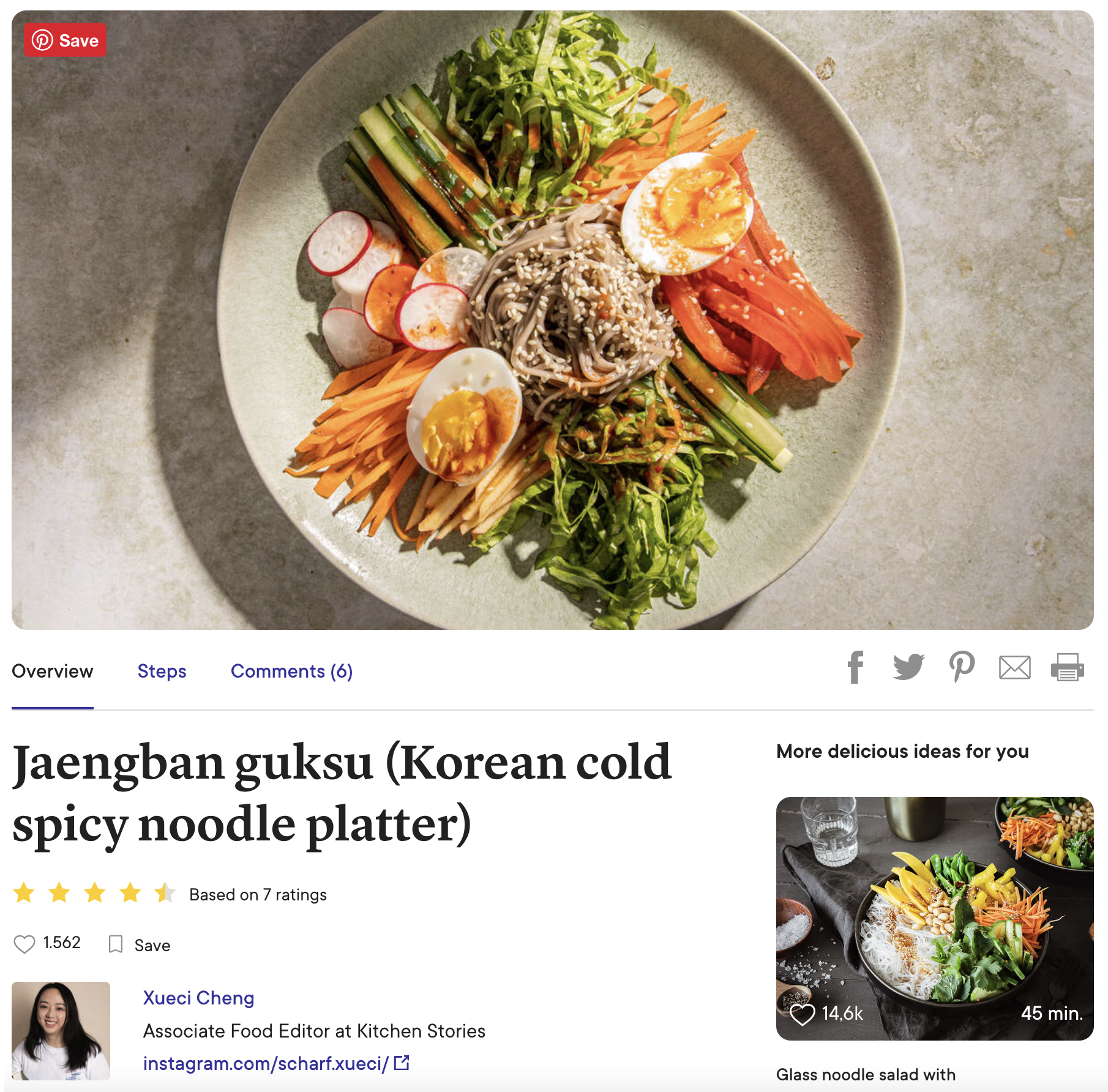
Looking into the kitchen stories website i wanted to create a design that brought ratings and comments in the user's view.
Designing Solutions
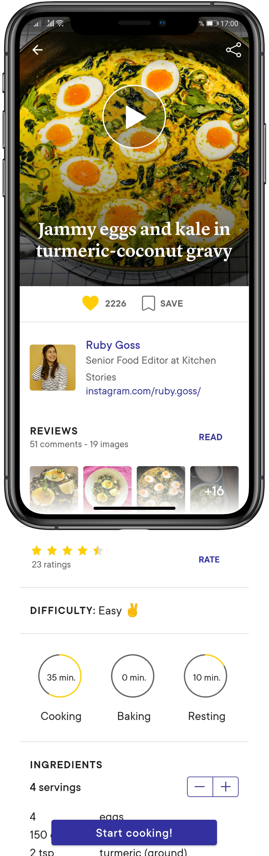
Current rate screens
When viewing the recipe, stars and rating is visible under the picture, comments show when scrolling.
How can we bring the two together to be visible for the user at once?
SOLUTION OPTION 1
Changing the look of the star ratings created more space to have all information together.
SOLUTION OPTION 2
Simplified look, stars (rating) and comments together. User has to click 'READ' to find both options
SOLUTION OPTION 3
Review and ratings in same area
This idea kept comments and rating as two different section but close together. However it also removed the recipe ratings from the top of the screen.
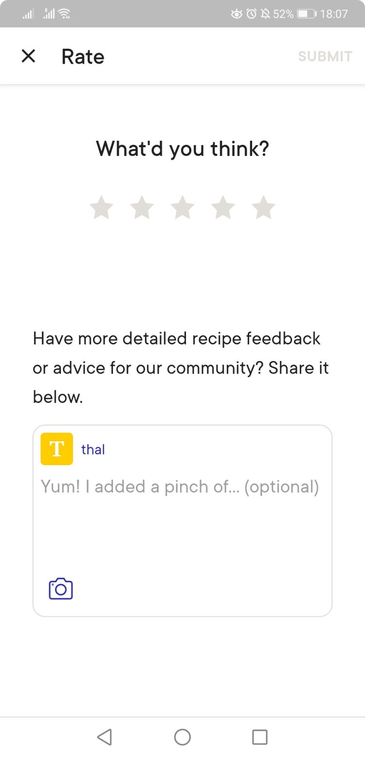
The Final Solution
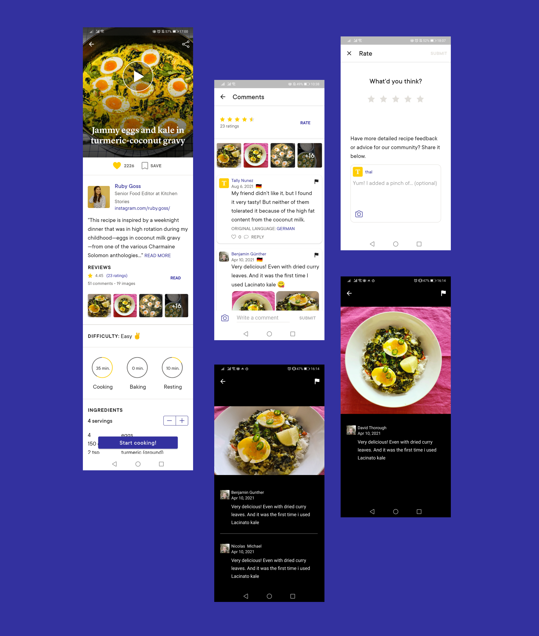
ORIGINAL FLOW
NEW FLOW
What has changed in the new flow:
- Rating and comments are close together
- Clickable ratings
- Clickable comments
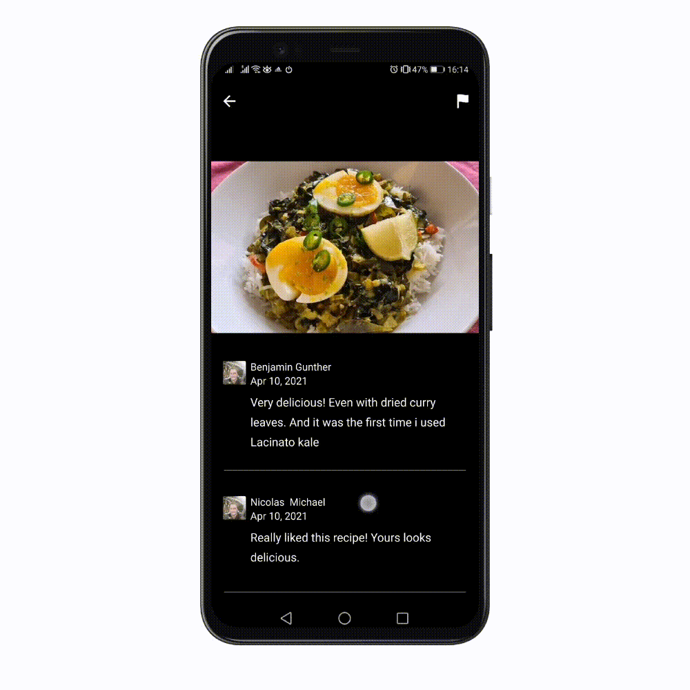
- Comments screen now also includes a rating section at the top
- Recipe shared pictures now have show user's comments too
NEXT STEPS
The initial testing has shown the direction of where to make changes. As a next step i would be testing the final solution to see how the users interact with it and to understand if the changes i have created, made the user flow better, removing any uncertainties.
Get in Touch
Contact
© Thalia Botsari 2025